Type Beat Thumbnail Design That Actually Gets Clicks (Decoded)
Open YouTube and search "Drake type beat." Scroll through the results for thirty seconds. You'll notice something: most thumbnails look almost identical. Dark background. Artist photo. Producer name in a bold font. Maybe a colored glow effect. Same layout, different name.
That sameness is both a symptom and a problem. It's a symptom because everyone copied what seemed to work early on. It's a problem because when everything looks the same, nothing stands out — and nothing that doesn't stand out gets clicked.
This article decodes what's actually happening at the thumbnail level on type beat channels, why certain designs consistently pull higher CTR than others, and what the data tells us about what works and what producers keep getting wrong.
First, the Number That Matters
YouTube itself confirms that half of all channels have an impressions click-through rate between 2% and 10%. For type beat channels, the lower end of that range is brutally common. Producers regularly report 3–4% CTR while established channels in the same keyword space run 6–8%.
That gap is not random. And it's almost never about the beat itself.
A CTR improvement from 4% to 7% on the same number of impressions means 75% more clicks without ranking for any new keywords, spending a dollar on promotion, or making a single additional video. Thumbnails are the highest-leverage variable most producers completely ignore.
The Four Thumbnail Archetypes Dominating Type Beat Search in 2026
After auditing the top-performing videos across dozens of type beat channels, four visual archetypes emerge consistently. Understanding which archetype you're using — and whether you're executing it well — is the starting point for any CTR improvement.
Archetype 1: The Dark Cinematic (The Dominant Default)
What it looks like: Near-black or very dark charcoal background. High-contrast artist photo (usually a well-known rapper) in the center or slightly left, often cut out with a soft edge or subtle glow. Producer name and "type beat" text in white or off-white, bold sans-serif. Occasionally a year tag in smaller text.
Why it exists: This format spread because it mirrors the aesthetic of the music itself — dark, atmospheric, nocturnal. It also became the default because it's technically easy to execute. Dark background hides imperfections. High contrast white text is always readable.
Why it underperforms for most producers: Saturation. When every channel in search results uses this exact template, the eye has no visual hook to land on. The brain sees pattern repetition and skips past. A producer's dark cinematic thumbnail competing against seven other dark cinematic thumbnails in the same search results is essentially invisible.
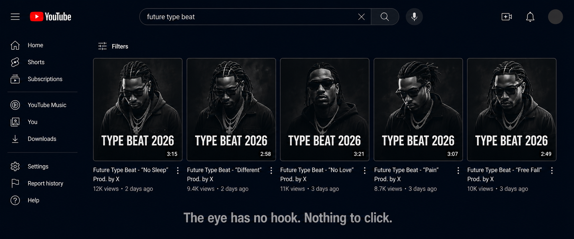
When it still works: On channels with strong subscriber bases where the thumbnail is appearing in subscriber feeds rather than cold search. Warm audiences who already recognize the channel brand will click on consistent visual identities even if they're not visually distinctive. For new channels targeting cold search traffic, this is the worst-performing archetype.
Archetype 2: The Color Pop (The Pattern Interrupt)
What it looks like: A single dominant background color — often a saturated blue, red, orange, or purple — replacing the default black. Artist image rendered in high contrast against it. Text in white or a complementary color. Sometimes a gradient rather than a flat tone.
Why it works: Pattern interruption. In a sea of dark thumbnails, a saturated color is the visual equivalent of someone raising their hand. The eye naturally moves to the anomaly. This is basic visual attention science: the brain flags contrast and novelty as potentially important.
CTR data point: Research analyzing thousands of top-performing thumbnails consistently shows that high-contrast designs with saturated, non-default colors outperform muted or dark ones when competing in cold search results. Channels that switched from dark cinematic to color pop on the same beat titles reported CTR improvements in the 1.5–3% range — which at scale is significant.
The execution trap: Doing this poorly by picking clashing colors, using low-quality artist images against the colored background, or making the text unreadable because there's not enough contrast between the text color and background. Color pop requires more design care than dark cinematic, not less.
Archetype 3: The Billboard (Text-Dominant)
What it looks like: The artist name and "type beat" text becomes the primary visual element rather than a secondary label. The image is smaller or used as a background element. Typography is massive, often stylized to match the artist's aesthetic. Think album cover rather than YouTube thumbnail.
Why it works for certain niches: When the artist's name itself is the click driver — i.e., when someone searching "Travis Scott type beat" already knows and wants that artist's sound — a huge, clean artist name in the thumbnail removes ambiguity. There's nothing to decode. The thumbnail and the title communicate the same thing simultaneously, which reinforces the message.
The specific advantage: Readability at small sizes. On mobile, where over 70% of YouTube views originate, a thumbnail that depends heavily on image detail falls apart when displayed at 2 inches wide. Large, clean typography remains legible at any size. Producers who test their thumbnails by shrinking them to phone-screen size before publishing consistently catch this.
Who it works for: More established channels where the producer's visual brand is already recognizable. For new channels, text-dominant thumbnails can look sparse without the context of brand recognition. The exception is when the typography itself is distinctive and artistic — not just a name in Arial Bold.
Archetype 4: The Hybrid Branded (The Long-Game Archetype)
What it looks like: A consistent visual system applied across every upload. Same background treatment, same color palette, same font choice and placement, same layout grid — but with enough variation (different artist image, occasional accent color swap) to prevent sameness within the same channel's catalog.
Why it compounds: Channels with consistent thumbnails see 15–20% higher CTRs from subscribers compared to channels with inconsistent visuals. This is because consistent color palettes across visual content can improve brand recognition by up to 80%. When a subscriber sees a new upload in their feed and immediately recognizes it as yours before reading your name, that's the hybrid branded archetype working.
The long game: This archetype doesn't win the first impression on cold search the way color pop does. But it builds something more durable: a visual identity that artists start to recognize and associate with quality. Over time, producers with strong brand identities convert more casual viewers into returning buyers because the channel looks like a professional operation.
The execution requirement: Committing to a visual system and actually maintaining it across every upload. This is where most producers fail — they'll design a good thumbnail template, use it for four videos, then break from it when they're in a hurry. Inconsistency destroys the compounding effect.
The Five Specific Mistakes Killing Type Beat CTR
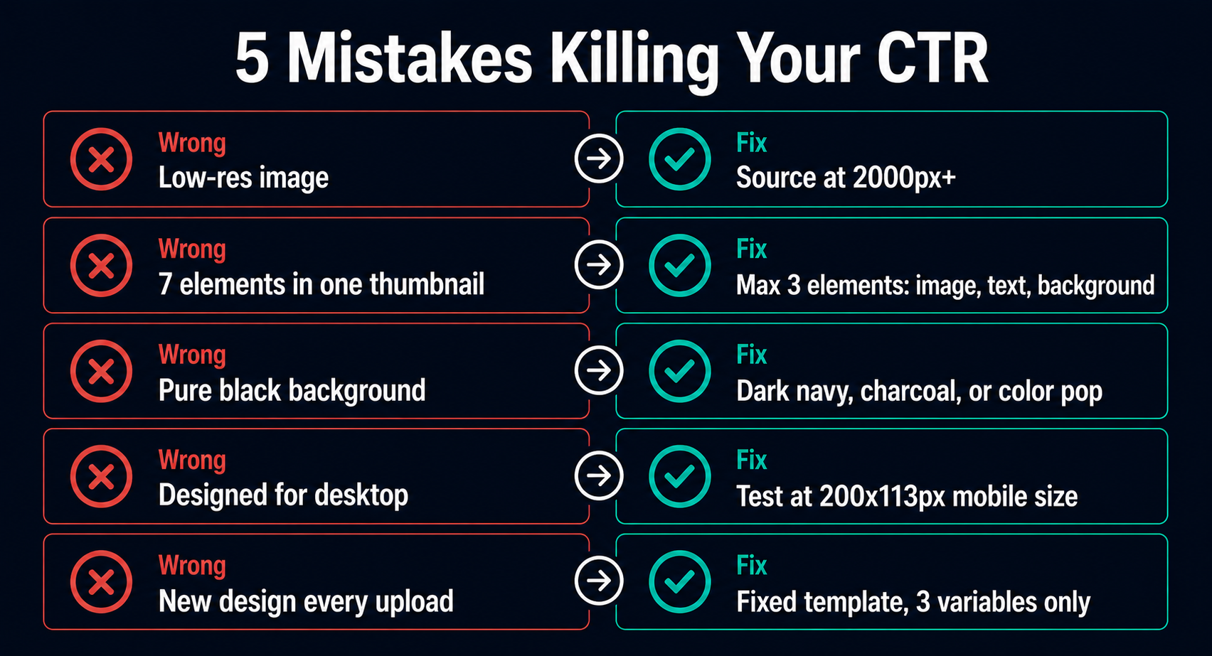
1. Using Low-Resolution Artist Images
The most common technical failure. Producers find an artist image on Google, download whatever version loads fastest, and use it without checking resolution. At thumbnail scale (1280x720), a low-res image doesn't look grainy on a desktop — it looks fine. On a smart TV, where YouTube traffic has grown significantly and thumbnails now display much larger, it looks visibly bad and signals low production value.
The fix: Source artist images at minimum 2000px wide before any editing. For the highest-profile artist names (which are also the most competitive keywords), finding professional press photos is worth the extra ten minutes.
2. Too Many Elements Competing for Attention
The human brain can process a maximum of three visual elements simultaneously at a glance. More than that creates overload, and the eye moves away without clicking. The worst type beat thumbnails have: artist image, glow effect, colored background, producer name, beat title, year, genre label, and a website URL. Every element added beyond three reduces the total impact of the thumbnail.
The fix: One focal image, one text element (artist name + "type beat"), one background treatment. Test your thumbnail by blurring it slightly. If you can still identify what it's communicating in half a second with blurred vision, the hierarchy is right. If it just looks like noise, simplify.
3. Red, White, or Black as the Primary Background
This one is counterintuitive but consistent: avoid red, white, and pure black as primary background colors. Red and white are dominant colors in YouTube's own interface — buttons, logos, backgrounds. A thumbnail built on those colors blends into the surrounding UI rather than standing out from it. Pure black is the type beat default, which is exactly the saturation problem described above.
The fix: Dark navy, dark purple, dark forest green, charcoal (not black) — these create the atmospheric energy of dark cinematic thumbnails while breaking from the pure black saturation. On the lighter end: rich orange, deep teal, warm amber — all create strong contrast against YouTube's interface.
4. Designing for Desktop Only
Over 70% of YouTube views happen on mobile devices. A thumbnail that looks great at full resolution on a 27-inch monitor may become entirely unreadable at 2 inches wide on a phone screen. The most common symptom: text that's technically there but too small to read without zooming in. An artist image that's detailed and impressive at full size but becomes an unidentifiable blob at mobile scale.
The fix: After completing your thumbnail design, export it and manually shrink it to approximately 200x113 pixels — the approximate size it appears on mobile search results. If the text is readable and the main image is still identifiable at that size, it passes. If not, simplify and scale up the key elements.
5. No System, No Consistency
This is the structural mistake that makes all the others worse. A producer who designs a new thumbnail from scratch for each upload has no compounding brand advantage. Each video starts from zero in terms of visual recognition. Returning viewers don't develop the pattern recognition that makes them more likely to click on a familiar visual style.
The fix: Design a template. Three elements, fixed positions, fixed fonts, fixed color palette. The only variables between thumbnails should be the artist image and the text. Everything else stays the same. This takes more thought upfront and saves every minute of design work on every subsequent upload.
What the Data Says About Thumbnail-Title Alignment
One thing YouTube's own data confirms: thumbnails generating high CTRs but poor retention ultimately harm video performance in the algorithm. This matters for type beat producers because it means designing a misleading or misaligned thumbnail — one that promises a sound or energy the beat doesn't deliver — will get you clicks that immediately drop off, which YouTube reads as a negative signal.
The thumbnail and the title need to promise exactly what the beat delivers. If the thumbnail has dark, aggressive energy and the title says "dark drill type beat," the beat should open with dark, aggressive energy. When what the viewer hears in the first ten seconds matches what the thumbnail suggested they'd hear, retention goes up. When there's a mismatch, they leave, and the algorithm distributes the video less.
For type beat producers, this means your thumbnail isn't just a click-generation tool. It's a pre-selection mechanism. The right thumbnail attracts the artist who wants exactly the sound you're offering, which means better retention, better engagement, and better algorithmic distribution.
The Thumbnail System That Scales
Here's the practical implementation for producers who want to stop designing thumbnails from scratch every time:
Build a template with three variables:
Artist image (swapped per upload)
Text line 1: Artist Name (swapped per upload)
Text line 2: "Type Beat [Year]" (updated annually)
Lock everything else:
Background treatment (color, gradient, or dark cinematic style)
Font choice and size
Text position (typically bottom third or left-aligned)
Image position and crop style
Your archetype selection test:
If your channel is new with under 2,000 subscribers and you're targeting cold search traffic: use Color Pop. Pattern interruption is your only weapon against established channels.
If your channel has 5,000+ subscribers and you're building a subscriber-driven channel: use Hybrid Branded. The consistency compounds.
If you're in a high-competition keyword space and your text is the clearest differentiator: use Billboard.
The one number to check weekly: Your per-video CTR in YouTube Studio analytics. Not your overall channel CTR — the individual video CTR. Videos with CTR below 4% are underperforming in search. Videos above 6% are pulling their weight. When a video consistently beats your average, study what's different about that thumbnail and replicate it.
The Compounding Effect Nobody Talks About
A well-executed thumbnail system does something that a collection of individually designed thumbnails never can: it makes your channel page a trust signal.
When an artist finds one of your beats, likes what they hear, and then visits your channel page to browse more, what they see is your entire catalog. A producer with 80 videos and a consistent, professional thumbnail system looks fundamentally different from a producer with 80 videos and 80 different design experiments. The first looks like a brand. The second looks like someone who's been figuring it out publicly.
Artists buying beats are spending money on a license from a stranger. Trust is a real factor in that decision. A channel that looks coherent and professional converts more of those channel-page visits into actual purchases. The thumbnail system you build today isn't just about getting the click on tomorrow's upload. It's building a body of work that looks credible to every artist who finds you six months from now.
That's the design decision worth making once and getting right — rather than making it badly over and over again on every upload.
For producers who don't have design skills or time to build and maintain this system manually, Typeflick handles thumbnail generation automatically for each beat, producing consistent AI-generated visuals that maintain a coherent visual identity across the entire catalog without Photoshop, Canva, or a design background.
Keywords: type beat thumbnail design, YouTube thumbnail CTR, type beat channel branding, click-through rate type beats, YouTube thumbnail tips for producers, beat channel thumbnail strategy, type beat visual identity